A funny thing happens in small urban gardens: we bring big-room expectations into a tiny footprint, then wonder why the space feels busy rather than calm. That’s where design and spatial concepts matter most - not as theory, but as everyday tools for deciding what deserves room, what deserves repetition, and what simply needs to be left alone.
Most over-designed gardens aren’t the result of arrogance or bad taste. They’re usually the result of good intentions arriving in the wrong order.
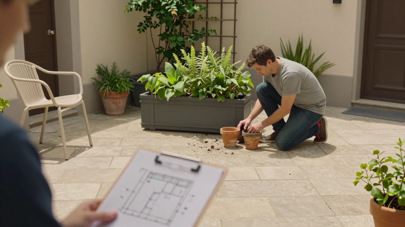
A friend once showed me a new courtyard that had everything: a pergola, a water bowl, a checkerboard of pavers, three types of screening, a fire pit, and planters at three heights. It looked “finished” in photos. In person, you could barely stand anywhere without feeling like you were blocking something.
What over-design looks like in a small garden (and why it feels so tiring)
Over-design in small spaces is less about having “too much” and more about breaking a few basic spatial rules without realising. The garden becomes a collage of features, each one individually nice, collectively exhausting.
You’ll recognise it by the symptoms:
- No clear pause: every view is interrupted by an object, an edge, or a change of material.
- Too many centres: the eye doesn’t know what the garden is about - dining, lounging, planting, storage, play.
- Fussy geometry: lots of small shapes (triangles, wedges, curves) that create awkward leftover bits.
- Micro-zones everywhere: a bistro corner, then a reading corner, then a herb corner - all competing for the same two metres.
It’s the garden equivalent of speaking over yourself. Nothing is wrong, but nothing can land.
The trap: designing by shopping list, not by space
Most small gardens are “designed” in the sequence life forces on people. First you buy the items you can picture: a table, some planters, maybe a pergola because privacy feels urgent. Then you try to fit paths around those purchases, and then you ask plants to soften the whole thing.
That order almost guarantees over-design because the space never gets a chance to set the rules. The objects do.
A useful mental swap is this: stop asking, “What features do I want?” and start asking, “What does the space need to do, and where can my body actually move?” In tight gardens, circulation is not a boring technicality - it’s the experience.
Why it’s rarely planned this way: small gardens are vulnerable to “compensating”
When a plot is small, it can feel like it must work harder to be worth it. People compensate by adding more variety: more materials, more plant types, more “moments”. It’s a totally human response, and it’s reinforced by inspiration photos that flatten depth and hide the awkward bits.
There’s also a particular urban pressure: you want privacy, storage, bin access, somewhere to sit, and somewhere green - all at once. Each need is valid. The over-design happens when every need becomes a separate structure rather than one integrated move.
A single trellis wall can be privacy, a backdrop, and a climbing frame for planting. Three different screens usually become three different visual problems.
A clearer way to think: hierarchy, not hustle
Good design and spatial concepts in small gardens come down to hierarchy. Decide what is dominant, what is supporting, and what is background. Without hierarchy, every element shouts, and the smallest garden has the loudest voice.
Try this quick hierarchy check:
- One primary function (the thing you’ll do most): eat outside, lounge, grow, play, or simply look out.
- One primary surface: a single main ground material that covers most of the area.
- One primary gesture: one strong line or shape that organises the layout (often a rectangle aligned to the house).
Then everything else becomes secondary: lighting, pots, a small water element, a fold-away chair. You’re not banning features. You’re giving them roles.
“Restraint” isn’t a style choice in small gardens; it’s a way of making the space legible.
The classic mistakes that create clutter (even with good taste)
A small garden can look expensive and still feel cramped. These are the repeat offenders.
1) Too many hardscape materials
Mixing five surfaces in a large garden can be charming. In a small one, it usually reads as patchwork.
A simple fix: keep one main surface, then use the second material only as a border, a step, or a threshold - not another field.
2) Edges that never settle
Little brick trims, scallops, tight curves and zig-zags create visual “static”. They also create planting strips that are too narrow to thrive, so you end up compensating with more pots.
Straighter, longer edges are not dull. They’re calming, and they make plants look fuller because the planting can be deeper.
3) Furniture that doesn’t match movement
A table that technically fits but blocks the back door will make the whole garden feel like an obstacle course. People then “fix” it by adding more nooks, which makes it worse.
Measure the boring bits: - 75–90cm clear for a comfortable walkway - enough chair pull-out space without hitting planters or walls
If you can’t move properly, you won’t use the garden, no matter how lovely it looks.
A small reset: how to de-design without ripping everything out
You don’t need a bulldozer moment. Most over-designed gardens improve with subtraction and consolidation.
- Remove one material (or visually merge it by repeating the dominant surface).
- Combine two zones into one (dining + lounging often works as one flexible area).
- Repeat fewer plant types (three stronger groups beat twelve single specimens).
- Move clutter to the perimeter (storage, pots, spare chairs), and keep the centre readable.
- Create one “quiet view” from inside: a single focal plant, wall colour, or simple feature.
The goal is not emptiness. It’s breathing space - so the plants and the people can both take their turn.
What to aim for instead: a garden that behaves like a room
Small urban gardens succeed when they borrow the logic of good interiors. You don’t put a coffee table, bookcase, sideboard, desk, and piano in the middle of a tiny living room just because you like each item. You decide what the room is.
A small garden that works usually has:
- a clear “floor” (one surface that reads as the base)
- a clear “wall” (planting or screening that forms the boundary)
- a clear “ceiling” only if needed (tree canopy, pergola, or shade sail - not by default)
Once the structure is calm, you can add personality without creating noise.
| Over-design habit | Better spatial move | Why it helps |
|---|---|---|
| Many little zones | One flexible main area | Fewer conflicts, more use |
| Patchwork paving | One dominant surface | Makes the space feel larger |
| Lots of specimen plants | Repeated groups | Creates depth and cohesion |
FAQ:
- How do I know if my garden is over-designed or just “full”? If your eye can’t find a resting place, and moving through the space feels like dodging objects, it’s likely over-designed rather than simply lush.
- Isn’t minimalism a bit bleak for a garden? It can be, but restraint isn’t the same as minimalism. The aim is fewer competing structures so the planting (and living) can feel generous.
- What’s the quickest change that makes the biggest difference? Simplify the ground plane: reduce the number of paving materials and make one surface dominant. It instantly calms the scene.
- Do small gardens always need built-in features to feel ‘designed’? No. Repetition, clear edges, and a coherent layout often read as more “designed” than adding pergolas, raised beds and screens.
- What if I genuinely need storage, bins, and seating in a tiny space? Integrate functions: a bench with storage, one screen that also supports climbers, and a single clear route for access. It’s not fewer needs - it’s fewer separate objects.


Comments (0)
No comments yet. Be the first to comment!
Leave a Comment