You see it in glossy garden makeovers and new-build courtyards: raised beds lined up like furniture, crisp edges, perfect rectangles. In real gardens, raised beds only look “designed” when proportion and scale match the space around them, and that’s exactly where this trend goes wrong in tight plots. If your patio is small or your borders are shallow, the wrong bed height can make everything feel cramped, even if the materials are beautiful.
The giveaway moment is usually after planting. You step back, expecting a calm, modern frame for greenery, and instead the bed reads like a bulky plinth. The plants look smaller than they are, the path feels narrower, and the garden starts to feel like it’s made of obstacles.
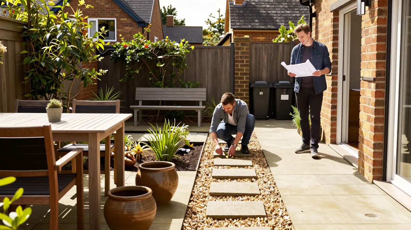
The modern look people copy (and why it turns heavy fast)
The current fashion leans towards tall, sharp-edged beds: sleepers, rendered blockwork, dark-stained timber, steel edging. On a large lawn with breathing room, the geometry can look intentional and architectural. In a small garden, the same move can feel like you’ve put a sofa in a hallway.
Height is the main culprit. A bed that rises to knee level might be ergonomic, but visually it becomes the dominant “object” in the garden. When the hard structure takes up more attention than the planting, the space reads as hardscape first, garden second.
Another reason it jars: tight spaces already have strong lines-fences, walls, paving joints, doors, bins, drains. Add tall raised beds and you multiply vertical edges at eye level, which makes the whole scene busier than you intended.
Proportion and scale: the quiet rule your eye can’t ignore
Most people think the issue is style (modern vs cottage, timber vs brick). It’s not. The issue is proportion and scale: how big each element is relative to its neighbours and to the viewer.
In small gardens, you’re almost always viewing things from close range: a kitchen window, a back step, a narrow path. That compresses perspective. A 600mm-high bed doesn’t feel “a bit raised”; it feels like a wall you have to navigate around.
A simple test works: if the bed height starts to block sightlines to planting from your most common viewpoint, it’s no longer a frame. It’s a barrier. And barriers make spaces feel smaller.
The common “tight-space” mistakes that create the problem
These are the patterns that repeatedly make raised beds look modern in photos, but awkward at home:
- Too much height with too little footprint. Tall and narrow reads top-heavy, like a planter on stilts.
- Beds that mirror the paving width. If the path and bed are similar widths, the garden becomes stripes, not flow.
- Hard edges everywhere. Multiple beds with the same sharp outline create a grid that fights soft planting.
- Dark materials in shade. Charred timber and black-stained boards can look severe when there isn’t enough light to lift them.
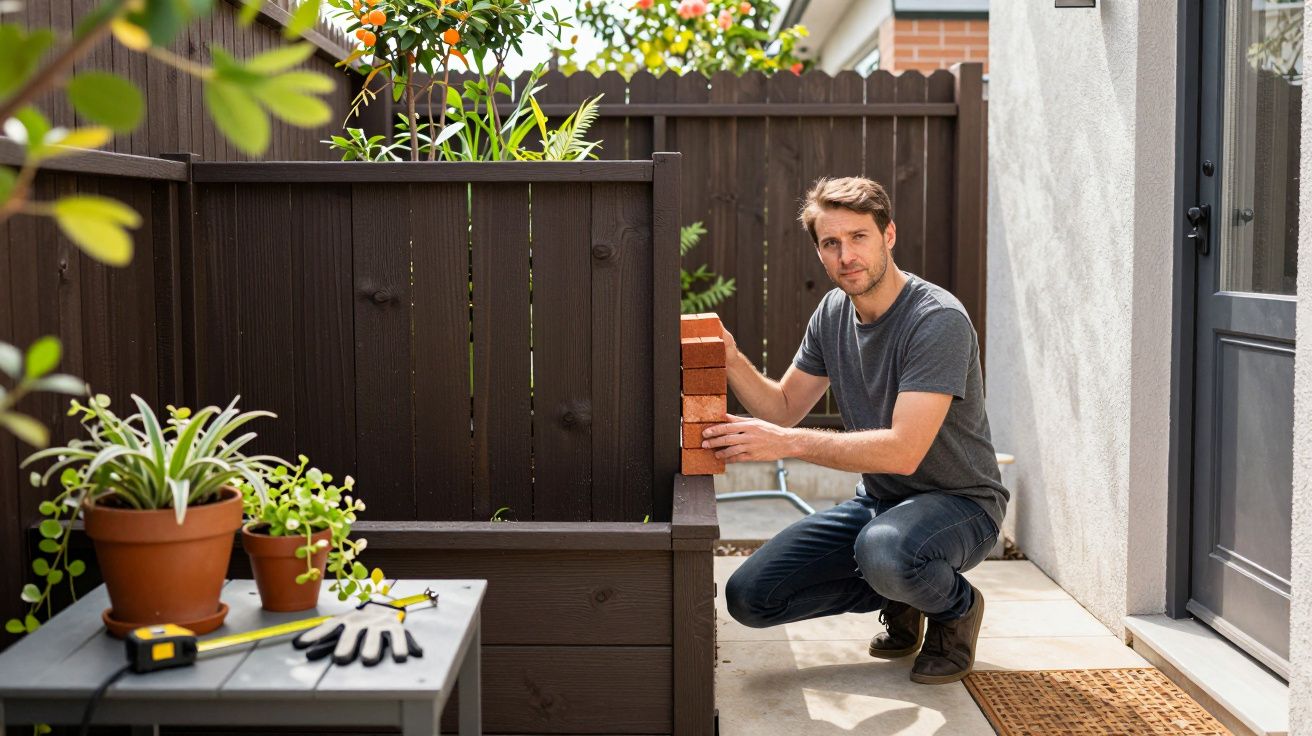
- Beds placed right up against a boundary. A tall bed tight to a fence turns the fence into a “back wall” and the bed into a “front wall”-a corridor effect.
None of these is a moral failing. They’re just what happens when a trend designed for generous plots gets shrunk without adjusting the ratios.
What to do instead: keep the lift, lose the bulk
You can keep the convenience of raised beds without letting them dominate.
1) Drop the height before you change the material
For most small gardens, a low lift reads calmer and more spacious. Think “defined border” rather than “garden furniture”. If you’re building from scratch, start lower than your inspiration image suggests and let planting do the softening.
If you already have tall beds, consider visually reducing them by: - Building up soil inside so planting spills and masks the edge - Adding a cap that’s slimmer and lighter in colour - Introducing one trailing plant every 60–90cm to break the line
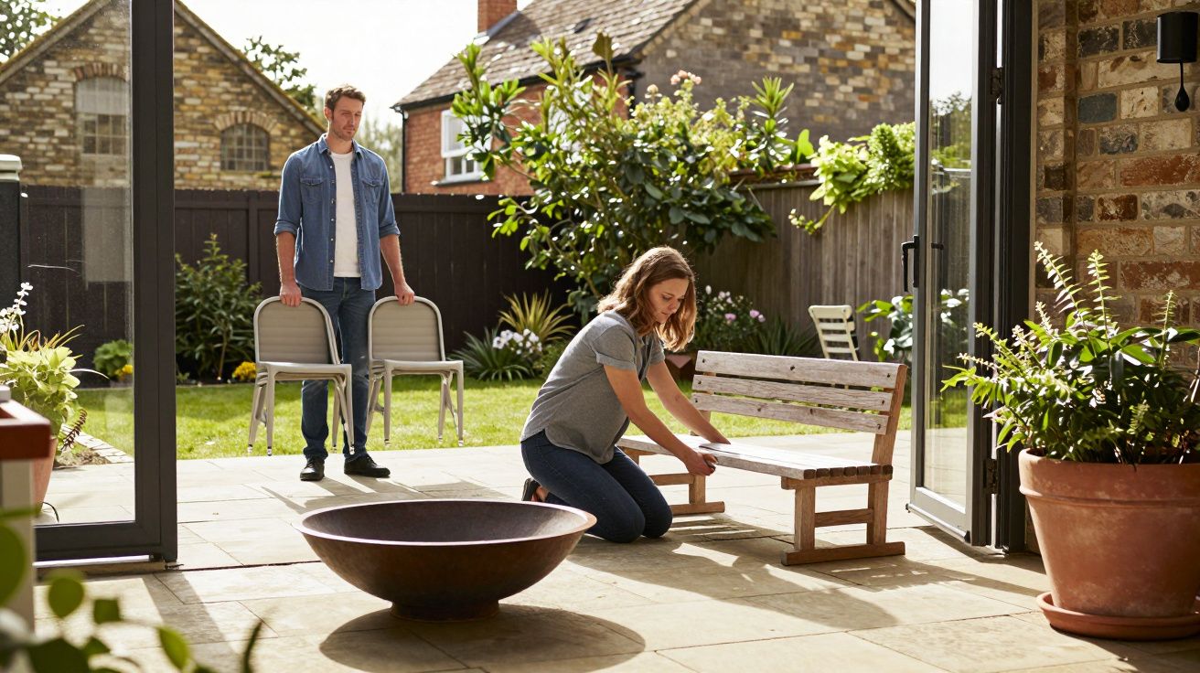
2) Make fewer beds, not more
One well-placed raised bed can look intentional. Three in a tight rectangle often look like storage units. Consolidating into a single L-shape or one long bed can make the garden feel wider and simpler.
3) Let planting interrupt the geometry
Modern doesn’t have to mean rigid. A repeated line is what makes the structure shout. Vary plant heights, include soft mounds, and allow a little overflow. When everything is clipped and level with the top edge, the bed becomes the main visual event.
4) Match the “weight” of the bed to nearby elements
A chunky sleeper bed next to delicate bistro furniture looks out of tune. Likewise, a heavy rendered bed beside thin fencing makes the fence look temporary. Aim for harmony: either echo the solidity elsewhere, or lighten the bed so it doesn’t overpower what’s around it.
A quick proportion check before you commit
Walk your garden as you actually use it: back door, kitchen sink, favourite chair, the route to the bins. From each spot, ask two questions:
- Do I see plants first, or structure first?
- Does this edge guide me through, or does it block me?
If the bed dominates in every view, it’s not a “feature”. It’s a constraint.
You can even mock it up with cardboard or stacked pots for an afternoon. It sounds basic, but it saves you from building something that looks impressive up close and oppressive from everywhere else.
The goal isn’t “no raised beds” - it’s the right kind of raised
Raised beds are genuinely useful: better drainage, easier access, warmer soil in spring, clearer planting zones. The mistake is treating height as the modern badge, instead of treating it as one tool among many.
When proportion and scale are right, a raised bed feels like it belongs. When they’re wrong, even expensive materials look like an add-on that shrinks the garden around it.
The best small gardens don’t look “designed” because they’re full of hard lines. They look designed because nothing is fighting for space.
FAQ:
- Are raised beds always a bad idea in small gardens? No. They can be ideal for drainage and tidy planting, but in tight spaces the height and number of beds matter more than the material.
- What height tends to look least bulky? Lower profiles usually read more spacious because they don’t interrupt sightlines; aim for a “border lift” rather than a knee-high wall unless accessibility is the priority.
- Do sleepers make the proportion problem worse? They can, because their thickness adds visual weight. In small gardens, slimmer edging or lighter finishes often feel calmer.
- Can planting fix a bed that feels out of scale? It can help a lot. Trailing plants, varied heights, and soft forms break the hard line so the structure stops dominating.
- What’s the simplest way to check if it will feel cramped? Stand at your most-used viewpoints (door, window, seating) and see whether the bed blocks planting or narrows the route visually. If it does, reduce height or simplify the layout.


Comments (0)
No comments yet. Be the first to comment!
Leave a Comment