Most gardens don’t become awkward overnight. The trouble starts with space zoning that looks tidy on paper, yet blurs how you actually move, sit, store tools and use functional garden zones day to day. It’s relevant because the mistake doesn’t show up as a “problem” until you’re living with it - and by then you’re rearranging furniture, re-laying paths, or just avoiding parts of the garden entirely.
The layout choice that quietly does the damage is simple: treating zones as isolated “islands” scattered around the plot, instead of a clear sequence connected by a legible route. It photographs well, but it’s a usability trap.
The island layout: why it feels fine at first
When you first sketch a garden, it’s tempting to place features where they fit: a dining spot here, a fire pit there, a veg patch in the sunniest corner. Each area makes sense on its own, and the plan can look balanced and calm.
The issue is that gardens are used like systems, not collections. People carry things, step in and out, supervise children, feed pets, hang washing, and switch between tasks in minutes. If zones aren’t organised around those transitions, friction builds quietly.
A garden can be “beautifully zoned” and still be exhausting to use, because the gaps between zones are where life happens.
What silently breaks when zones don’t form a sequence
Island zoning creates small, repeated inconveniences. None are dramatic, which is why they persist for years.
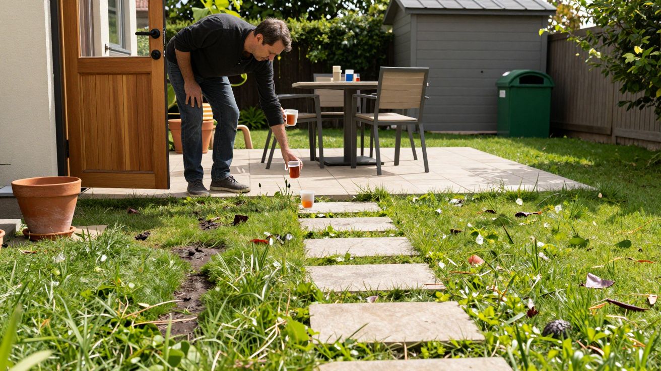
- Circulation becomes accidental. You cut across planting, skirt furniture, or take the same muddy shortcut because the intended route is unclear.
- Every task takes two trips. Tools aren’t near the job, cushions aren’t near seating, and the bin route crosses the social area.
- Privacy fails in odd ways. You can’t sit without being on display, or you have to walk through the “quiet corner” to reach the shed.
- Maintenance spreads everywhere. Edges multiply, making mowing, sweeping and weeding slower than it needs to be.
Over time, you start “editing” the garden with behaviour: you stop using the fire pit, you avoid the bench, you store things where they don’t belong because it’s easier. That’s the point usability has already been lost, even if nothing is technically wrong.
A quick test: can you describe your garden in one sentence?
Good space zoning usually has a readable story. You can explain how the garden works without listing features.
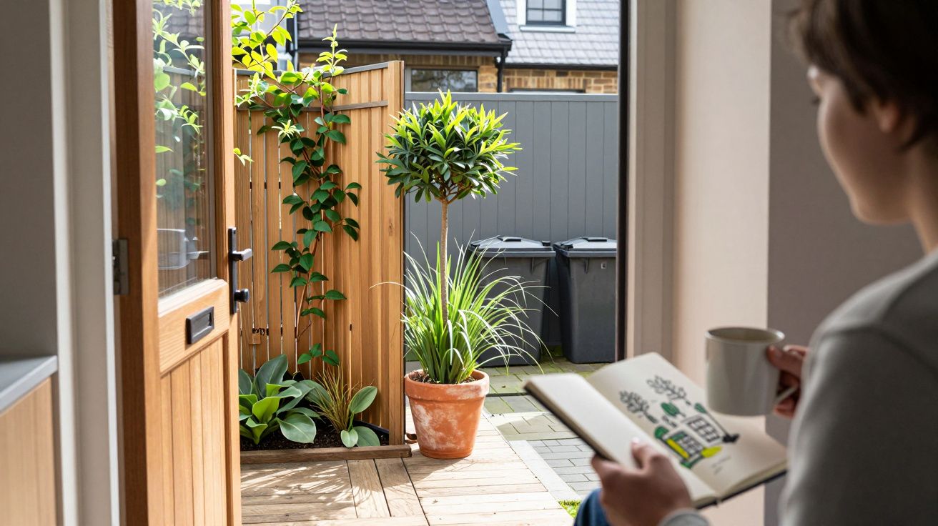
Try this: imagine coming out of the back door with a mug of tea. Where do you naturally go first, and what do you pass on the way? If the answer is “it depends” or “I sort of weave around”, that’s often a sign the zones are not aligned with the main journey.
A simpler structure tends to win:
- Arrival (door/threshold and a clean standing spot)
- Everyday use (seating, herbs, play, laundry - the high-frequency zone)
- Destination (dining, sun trap, fire pit - the long-stay zone)
- Service (shed, bins, compost - the practical zone kept out of the social path)
The order can change, but the logic shouldn’t.
The fix: connect functional garden zones with one “spine”
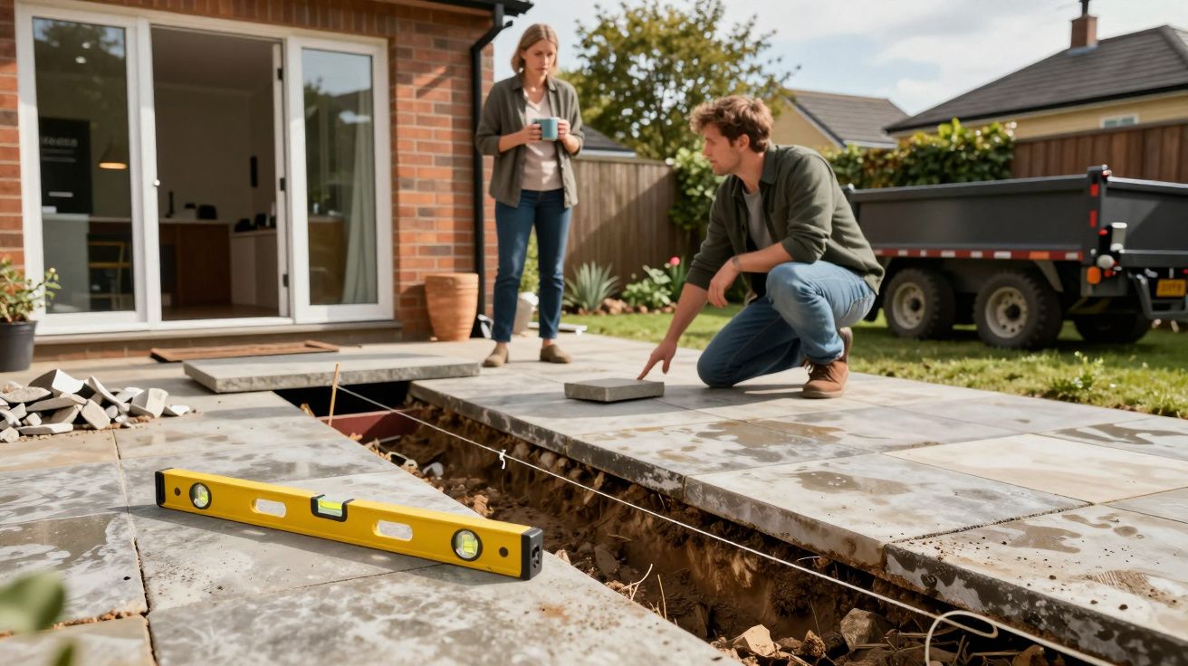
You don’t need to redesign everything. You need one dominant route that ties zones together, so the garden reads as a sequence rather than a scatter.
Think of it as a spine: a path, terrace edge, pergola line, lawn margin, or even a repeated strip of gravel that tells your feet where to go. Once that spine exists, your zones can “clip onto” it.
Practical ways to do it without major work:
- Widen the main path, not every path. One comfortable route beats three narrow ones.
- Pull one key zone closer to the house. Everyday seating near the door often fixes half the problem.
- Align openings. Gates, steps, shed doors and patio gaps should point to each other, not into planting.
- Use consistent cues. The same edging, lighting, or surface tone can signal “this is the route”.
The goal isn’t more hard landscaping. It’s fewer decisions per step.
Common “nice idea” placements that cause the most friction
Certain choices are repeat offenders because they prioritise symmetry or novelty over use.
Dining placed furthest from the kitchen
It looks like a destination, but it turns every meal into logistics. You notice it most when carrying hot food, clearing plates, or grabbing forgotten items.
A shed tucked behind the “feature” area
You end up walking through social space with tools, mud on shoes, or wheelie bins. The garden starts to feel like a corridor instead of a room.
A lawn used as the connector between everything
Lawns are great destinations, but poor highways. In winter it becomes churned, and in summer you keep stepping around play items or garden furniture.
Too many micro-zones
A chair in a corner, a bistro set on a side strip, a bench under a tree - each seems harmless. Together they create a garden that’s all edges and no flow.
A simple zoning plan that stays usable
If you’re starting from scratch, or rethinking a messy layout, aim for fewer, clearer zones. Most family gardens don’t need more than three “people” zones plus one service zone.
- Home zone: immediate terrace/step-out area, storage for cushions, somewhere to put a drink.
- Social zone: dining or lounge, positioned to be reached without crossing planting.
- Flexible zone: lawn or open surface for play, pots, a paddling pool, or extra seating.
- Service zone: bins, compost, shed, tucked away but directly reachable.
Once this backbone works, you can add character with planting and details without sacrificing usability.
The early warning sign to watch for
If you find yourself creating unofficial routes - worn grass lines, stepping stones added “temporarily”, furniture constantly moved to clear a passage - the garden is already telling you the zoning isn’t functioning as a sequence.
Fix the connections first. The garden will feel larger, calmer, and easier to maintain, even if you don’t change a single feature.


Comments (0)
No comments yet. Be the first to comment!
Leave a Comment