You can stand at the kitchen doors and admire how the decking squares up to the paving, how the boards line through like graph paper. But if movement flow has to carry kids, plates, a dog, and the occasional wheelie bin, a neat decking layout can quietly fail in the first five steps. It matters because outside spaces don’t just need to look composed; they need to move like a room you can actually live in.
I’ve seen this pattern again and again: a picture-perfect platform, a crisp set of steps, a planter used like punctuation. Then the first barbecue happens, and everyone funnels into the same narrow pinch-point, hovering with drinks because there’s nowhere to pass without turning sideways. The geometry is tidy. The circulation is not.
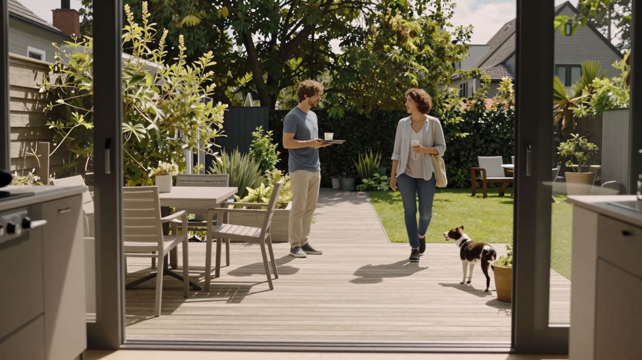
The invisible test: can two people pass without negotiating?
A deck can be “right” on paper and wrong in your body. If you have to pause to let someone through, or you keep skirting a corner table like it’s a bollard, the space is telling you something: the flow line is broken.
A useful rule is embarrassingly human. Can two adults walk past one another comfortably along the main route from door to garden without touching furniture or edging along the balustrade? If not, you don’t have a route; you have a squeeze.
Common culprits tend to look like design features:
- A central step that splits the deck into pretty levels but forces everyone onto one track
- A dining set placed on the only straight line from house to lawn
- Planters used to “frame” an edge that end up stealing the turning circle
- A single narrow stair that becomes the whole garden’s doorway
The result isn’t dramatic. It’s constant. Little pauses, tiny detours, the feeling that the deck is for looking at rather than using.
Why neat layouts collapse: they prioritise lines over paths
Decking boards love discipline: parallel runs, symmetrical margins, clean picture-frame borders. Movement flow doesn’t care about any of that. It wants a desire line-door to seat, seat to lawn, lawn back to tap-without asking permission.
The clash usually happens when the layout is designed from the edge in, instead of from the routes out. You end up with a “hero view” from inside the house, but the deck behaves like a stage set: good from the front, awkward in the wings.
Look for these tells:
- The door opens into a furniture zone, not a landing zone.
- The main route requires a turn around a table corner.
- The only stair is also the only passing place.
- There’s no clear “drop zone” for shoes, watering cans, or a hot tray.
If you’re thinking, we’ll just walk around it, that’s the point: you shouldn’t have to.
A small fix that changes everything: design the corridor first
Before you move a single joist, draw the routes the way your feet draw them. Start at the door, then trace to the lawn, the shed, the bin store, the rotary line, the favourite chair spot. Give those lines first claim on space, then fit the neatness around them.
Practical tweaks that keep the deck looking sharp while behaving better:
- Widen the main run from door to garden, even if it means a smaller dining area.
- Rotate the dining zone so chairs pull out away from the thoroughfare, not into it.
- Split levels only when they earn it (a view, a boundary, a slope), not just for visual interest.
- Add a second access point-a wider step run or a side stair-so traffic can loop rather than bottleneck.
- Build in a clear landing outside the door: a small unfurnished patch that feels like a hallway.
If you want the tidy board alignment, keep it-just don’t let it dictate where bodies have to go.
The “barbecue rehearsal” you can do in five minutes
You don’t need software. You need a few objects and a bit of honesty. Put out your table and chairs (or mark them with boxes), then rehearse the day you actually use the deck: carrying a tray out, someone coming in, someone heading to the lawn, someone opening the door behind you.
If you keep stepping off the deck to pass, or chairs become temporary barricades, the layout is telling you what the photo won’t. This is also when you notice the subtler stuff: a corner that catches your hip, a step edge that forces a stutter-step, a route that crosses the “wet zone” near the tap.
Let’s be honest: nobody designs for the moment two people try to carry food in opposite directions. But that’s the moment that decides whether a deck feels effortless.
A quick check card for movement flow (before you commit)
- Main route: clear, obvious, and not through the dining area
- Passing space: two people can pass without turning sideways
- Door zone: a small landing with no chair backs in the swing
- Loops: more than one way to get to the lawn (even if one is smaller)
- Edges: planters and rails don’t steal the turning circle at corners
| Problem you’ll feel | What’s causing it | A simple correction |
|---|---|---|
| Everyone bunches by the door | No landing zone | Leave an unfurnished “hallway” patch |
| Chairs block the route | Dining set on the desire line | Rotate/relocate dining to the side |
| Steps become a bottleneck | Single narrow stair | Widen steps or add a second access |
FAQ:
- Do I have to sacrifice symmetry to fix movement flow? Not necessarily. You can keep a symmetrical board pattern and still allocate a wider, straighter route-think of it as hiding a corridor inside the composition.
- Is a multi-level deck always bad for circulation? No, but each level change should support a use (seating ledge, slope handling, zoning). Random “feature steps” often create pinch-points.
- What’s the fastest way to see if my plan will work? Mark furniture and edges with tape or boxes and do a “barbecue rehearsal”: carry a tray, open the door, pass someone, and head to the lawn. If you hesitate, the layout needs space where you’re currently decorating it.


Comments (0)
No comments yet. Be the first to comment!
Leave a Comment