You can spend a small fortune on plants and still feel like your outdoor space never quite settles. In courtyard gardens, the real headache is often proportion and scale - the way walls, paths, furniture and sightlines fight each other in a tight footprint. Fix that, and suddenly even ordinary planting looks intentional, calmer, more “designed”.
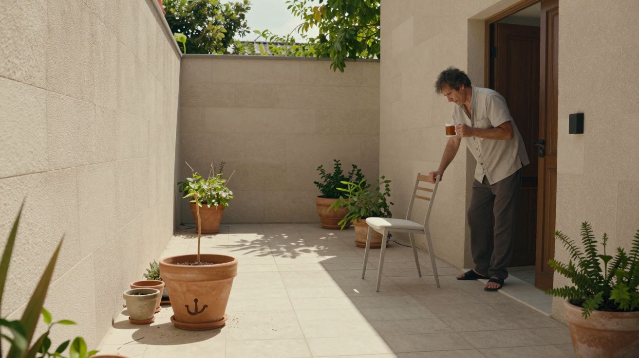
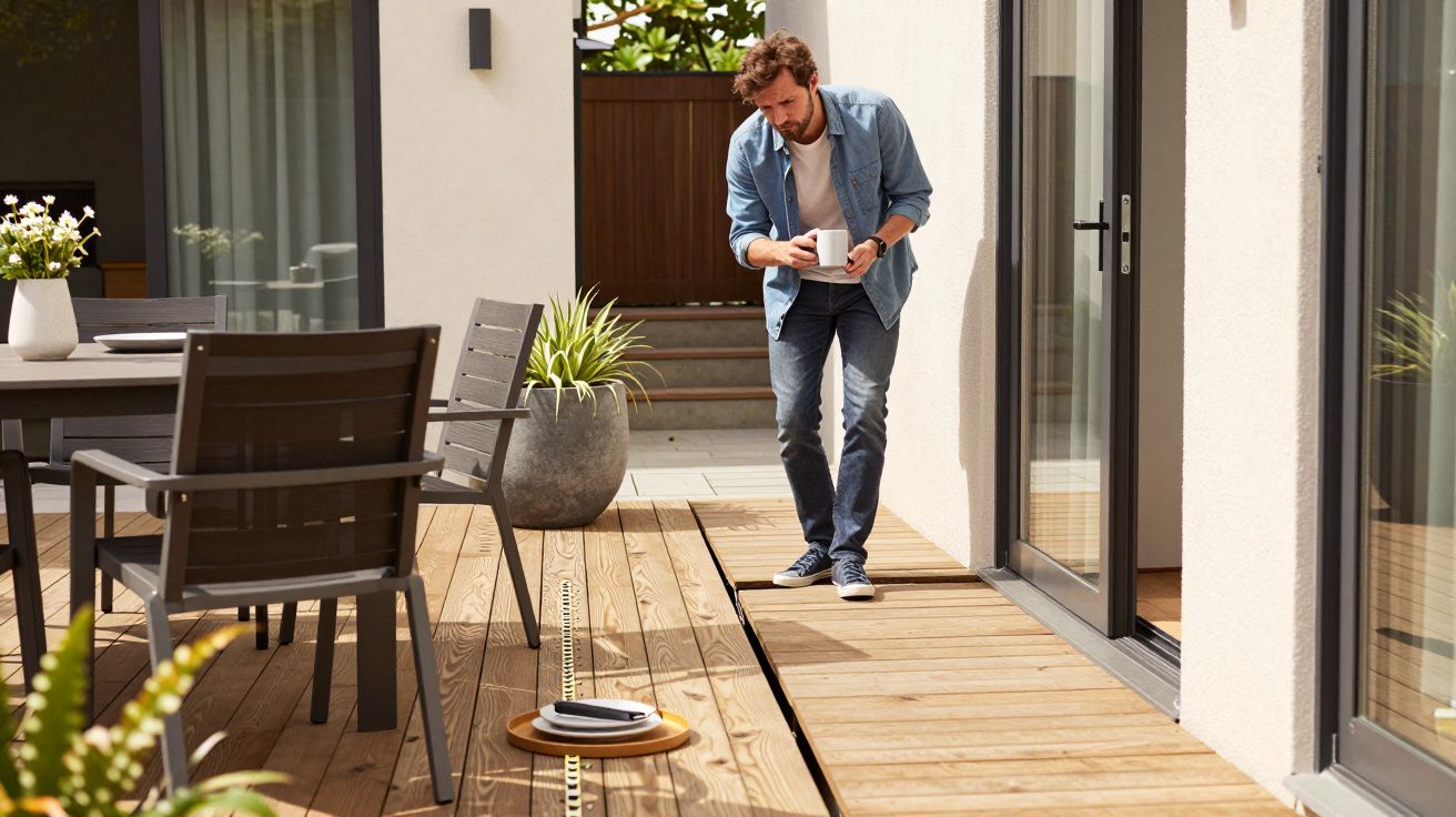
It usually shows up in the same moment: you step outside with a mug of tea and realise you don’t know where to sit, where to look, or how to move without bumping into something. Nothing is wrong exactly. It just feels awkward, like a room where the sofa is a bit too big and the rug is a bit too small.
The courtyard isn’t empty. It’s just badly measured.
Courtyards read as architecture first and garden second. High boundaries create a box, and a box exaggerates mistakes. A narrow path feels narrower. A tiny table feels toy‑like. A single oversized pot can look like it’s blocking the only air in the space.
Most people respond by adding more life: more pots, more climbers, more colour. That can help, but it can also make the geometry problem louder. If the “floor plan” doesn’t work, planting becomes clutter rather than softness.
A useful mental shift is to treat the courtyard like an outdoor room with hard edges you can’t move. Your job is to set the proportions inside the room so everything else has a place to belong.
The three geometry traps that make good planting look messy
There’s a pattern to the courtyards that never feel finished. It’s rarely the species list. It’s usually one of these.
1) The path is the wrong width (or it appears to be)
A path that’s too tight forces you to edge sideways past pots and chairs. A path that’s too wide can make the courtyard feel like a corridor with a strip of garden stuck to it. In small spaces, “circulation” isn’t a luxury - it’s the design.
A practical rule: decide whether the courtyard is for passing through or for being in. If it’s both, be honest about which one wins most days, then size everything around that.
2) The seating doesn’t match the enclosure
Tall walls create visual weight. Lightweight café furniture can look lost against them, like it’s been dropped into a service yard. On the other hand, chunky built‑in benches can dominate a tiny footprint and make it feel like a waiting room.
The fix isn’t always “buy bigger”. It’s “anchor the seating”. A bench looks right when it relates to something: a line, a corner, a planter edge, a level change. Floating furniture in the middle of a courtyard often reads as temporary, even if it cost a lot.
3) Pots are all the same size (or all different for no reason)
Rows of identical small pots create a fussy rhythm. A random mix of sizes creates visual noise. Courtyards need a hierarchy - a few big elements that hold the space, then smaller ones that support them.
If your courtyard feels busy, it’s often because everything is competing at the same volume.
A simple way to “see” proportion before you change anything
Before you buy a single plant, do one slightly boring thing: measure. Not obsessively, just enough to stop guessing.
- Sketch the courtyard on paper with rough dimensions.
- Mark doors, steps, drains, and the swing of any doors.
- Decide your main use: breakfast spot, evening lounging, kids’ play, a thoroughfare, or a view from indoors.
- Identify one primary rectangle inside the space: the “rug” area where seating/standing will happen.
That primary rectangle is your scale reference. Once it’s set, everything else gets easier: furniture size, pot size, even plant choice. You’re no longer decorating a void; you’re furnishing a defined zone.
The fix most people avoid: fewer elements, placed harder
Courtyard gardens often improve by subtraction. Not because minimalism is morally superior, but because small spaces punish indecision. You don’t need ten features. You need two or three, and they need to sit in the right places.
Try this sequence:
- Choose one strong line. A straight path, a single raised planter edge, or a centred axis to a focal point. Courtyards love a clear “read”.
- Commit to one anchor. A built‑in bench, a substantial pot, a small tree, or a water bowl - something with weight.
- Repeat one material. Same paving tone, same timber, same pot finish. Repetition is how you get calm.
- Then add planting to soften edges. Planting performs best when it’s supporting geometry, not trying to rescue it.
It can feel counterintuitive, especially if you enjoy collecting plants. But the moment the layout clicks, you’ll notice something odd: you start wanting fewer plants, not more, because each one suddenly has room to be itself.
How to make a courtyard feel bigger without lying to yourself
People chase the “bigger” feeling with mirrors, tiny trees, and lots of pale paint. Sometimes that works. More often, the biggest win is simply making the scale consistent so your eye stops tripping.
A few reliable moves:
- Keep the floor quiet. Too many paving patterns chop the courtyard into fragments.
- Use verticals intentionally. One trellis panel that aligns with seating feels designed; three mismatched panels feel like patching.
- Limit the palette. Two greens, one flower colour, one pot finish. Courtyards reward restraint.
- Make corners do work. A corner bench or L‑shaped planter uses “dead” space and restores proportion.
None of this is anti‑plant. It’s pro‑plant, in the sense that plants look better when the stage is properly set.
The quick check: does each object earn its footprint?
A courtyard is essentially a list of footprints: table, chairs, pots, bins, storage, barbecue, step clearance. If too many items “sort of” belong, the whole space feels temporary.
Walk outside and ask, item by item:
- Does this have a clear reason to be here?
- Is it the right size relative to the walls and floor area?
- If it moved 30cm, would the courtyard work better?
Courtyards don’t forgive vague answers. They reward decisive ones.
| Geometry issue | What it feels like | One practical correction |
|---|---|---|
| No hierarchy of sizes | “Cluttered”, even with nice plants | Add one large anchor pot/planter and remove 3–5 small ones |
| Weak circulation line | Constant shuffling around objects | Define a clear path width and keep it clear end to end |
| Furniture floating | “Temporary” and exposed | Push seating to an edge and relate it to a line or corner |
FAQ:
- Is this just another way of saying “make it minimalist”? Not necessarily. You can have a lush courtyard, but it needs a clear layout and a hierarchy so the lushness reads as intentional rather than crowded.
- What’s the fastest change if my courtyard feels awkward? Remove half the small pots for a week and push seating to a boundary. If it immediately feels calmer, you had a scale problem, not a planting problem.
- Do I need a designer to fix proportion and scale? No, but you do need to measure and commit. A rough plan and one anchor element often achieves 80% of the improvement.
- What if my courtyard is mainly viewed from inside? Treat it like a picture: set one strong focal point, simplify the floor, and make vertical elements align so the view feels composed.
- Can colour fix bad geometry? Colour can distract, but it won’t resolve awkward circulation or mismatched furniture scale. Fix the layout first, then use colour to add character.


Comments (0)
No comments yet. Be the first to comment!
Leave a Comment